How I design UI/UX with AI
Code is the worst place to start UI/UX work.
The order that works for me is: Image, ASCII, contracts, component.
UI/UX takes repeated refinement. Each pass changes the next one. The more I understand the problem and the people using the product, the more intention I can put into the interface.
1. Image
I start in ChatGPT, but I ask for images before code. I don’t use Figma because I don’t know how :(.
I describe the product philosophy instead of aesthetic buzzwords:
Create a brutally minimal UI for a desktop application. Reduce, simplify, and subtract what is not needed. Every control must help someone complete work. Use a text-first layout, clean typography, quiet charcoal and off-white surfaces, and no decorative chrome.
The image sets a visual direction. It does not provide a specification.
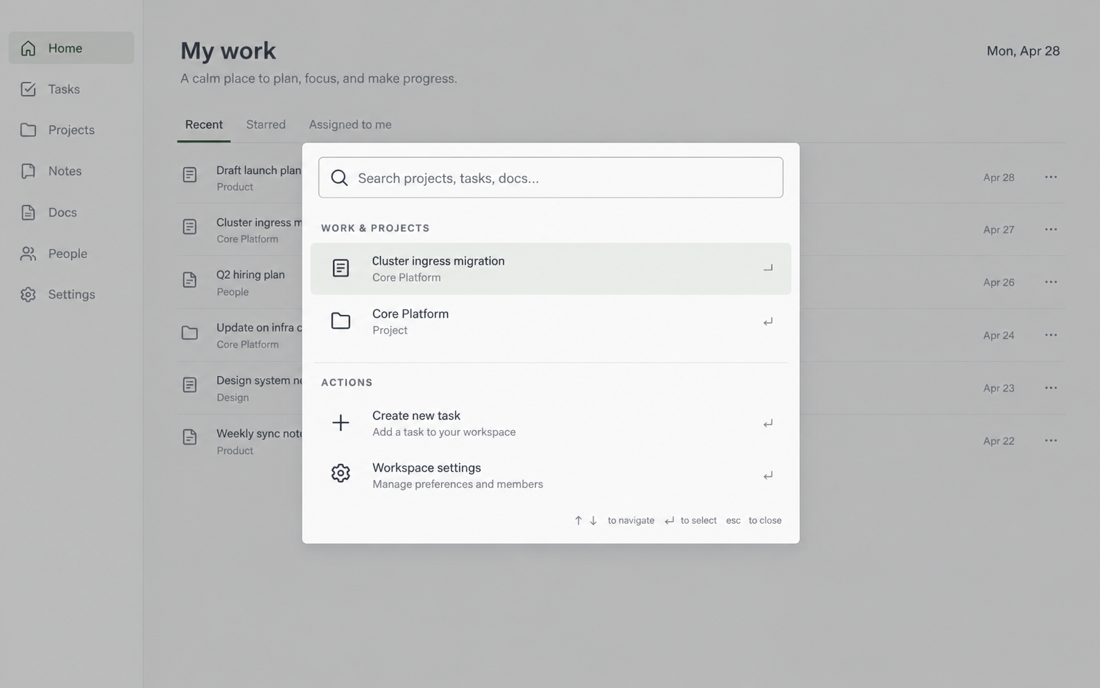
An image gives you contrast and visual density. It cannot define behavior: how the dialog handles wrapped text, narrow viewports, or the Escape key.
2. ASCII
I open layouts.md and redraw the structure in a monospace grid:
+-----------------------------------------------------------------+
|  Search projects, tasks, docs…                             Esc   |
+-----------------------------------------------------------------+
|  WORK & PROJECTS                                                |
|  > Cluster ingress migration        Core Platform               |
|    Core Platform                    Project                     |
|                                                                 |
|  ACTIONS                                                        |
|    Create new task                 C                            |
|    Workspace settings              Settings > Workspace         |
+-----------------------------------------------------------------+
|  ↑↓ Navigate        Enter Open        Esc Close                  |
+-----------------------------------------------------------------+
The monospace grid forces structural decisions:
- Search gets one dedicated row.
- Results keep primary and secondary labels.
- Work and actions stay in separate groups.
- The footer owns keyboard hints.
The model now receives geometric boundaries instead of visual guesses.
3. Contracts
Before touching component code, I lock two small contracts.
The first is the layout contract (LAYOUT_CONTRACT.md). It freezes the accepted geometry so future prompts do not renegotiate settled decisions:
# Command dialog layout contract

Status: accepted
Changes require explicit approval.

- Dialog width: 650px maximum with 24px viewport margins
- Search occupies the first row
- Results keep primary and secondary labels
- Work and actions remain separate groups
- Keyboard help stays in the footer
- Trailing metadata hides below 600px
- Interactive controls keep a 44px minimum target
If the layout must change, the agent proposes the contract change before editing code.
The second is the design contract (DESIGN.md). It records the rules that survive individual prompts:
# Product design system

- Quiet and text-first
- One primary action per view
- White, gray, and charcoal surfaces
- Semantic color only for warnings and destructive actions
- Inline editing before modal forms
- Remove any control that has no current job
This stops the model from adding speculative buttons and decorative flourishes.
4. Component
I build the component outside the application tree with mock data:
design-system/
├── DESIGN.md
├── layouts.md
├── LAYOUT_CONTRACT.md
├── command-dialog.html
└── command-dialog.tsx
The HTML file is the visual harness. The TypeScript component is the implementation. Neither file depends on application routing, global state, or backend endpoints.
In this narrow sandbox, I verify spacing, focus rings, keyboard navigation, empty results, and long labels. Only when the component works in isolation do I move it into the application.
Live comparison
Here are all stages together. The component tab is interactive: search the list or use the arrow keys.